Data Analysis
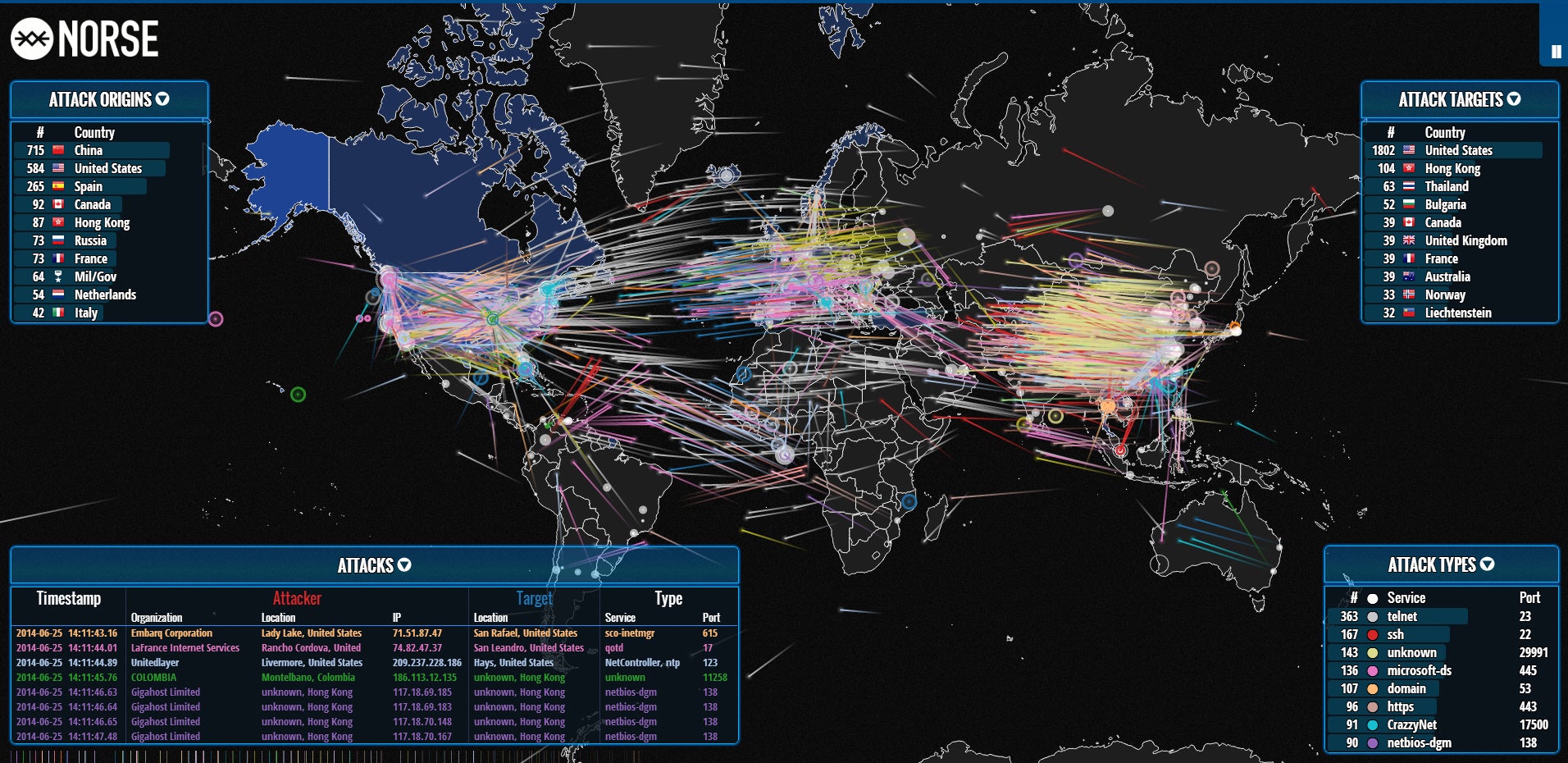
On 11/8, I watched the Art of Data Visualization by PBS
Studios. I thought it expressed clearly the importance of hard, raw data and
the importance of visualization to convey that data. The most interesting part
of the program I gleaned from it was that visualization is a linear decision-making
process in which the creator must take into account what he/she wants to say,
what the reader wants to say and the data itself. I never previously thought
that data would be most paramount when creating visualization; however, I
suppose there would be no point to the data if it could not convey its message
and be used for the greater good. Furthermore, I liked the emphasis on the
importance of our own abilities to recognize patterns and make decisions to
survive, which allows the designer to communicate a lot of information very
quickly. I did take issue with the idea one of the presenters brought up, which
was that viewers want complicated data to be simplified. I felt this was a
contrast to what another presenter said, which was respect your audience. As
the audience, I respect the data and the hard work that was put in to gather
it; therefore, I wouldn’t want to demean the author or myself by pretending
this data was easily won. I think the viewer would appreciate the complexity as
much as he would want easy information.


Comments
Post a Comment